Man Up Tasmania
Man Up Tasmania is a mental health organisation founded on the North-West Coast, motivated to change the culture and perception of well-being across Tasmania. The name itself was chosen by the co-founders to shift the narrative from stoic masculinity to a healthy definition of courage and passion, therefore they sought a new brand identity that encourages deeper thinking, considers community and is ultimately hopeful.
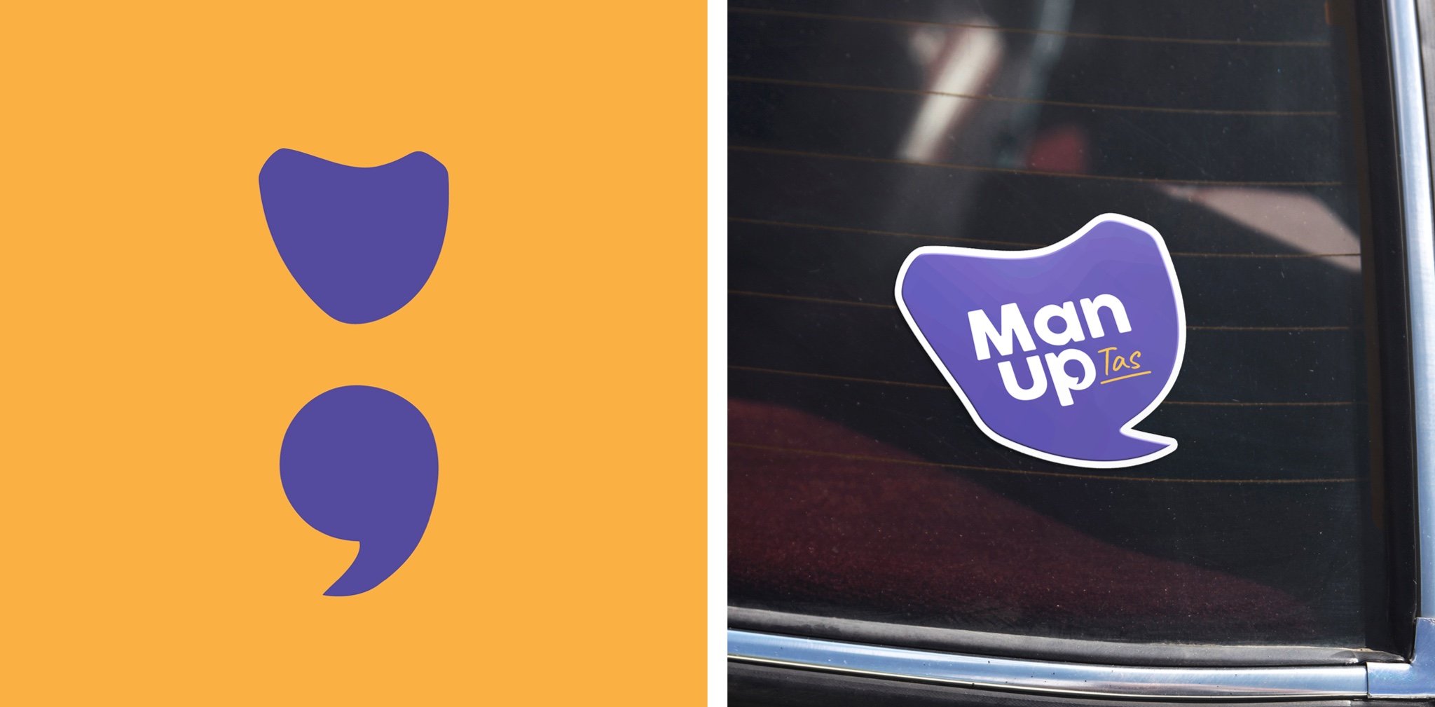
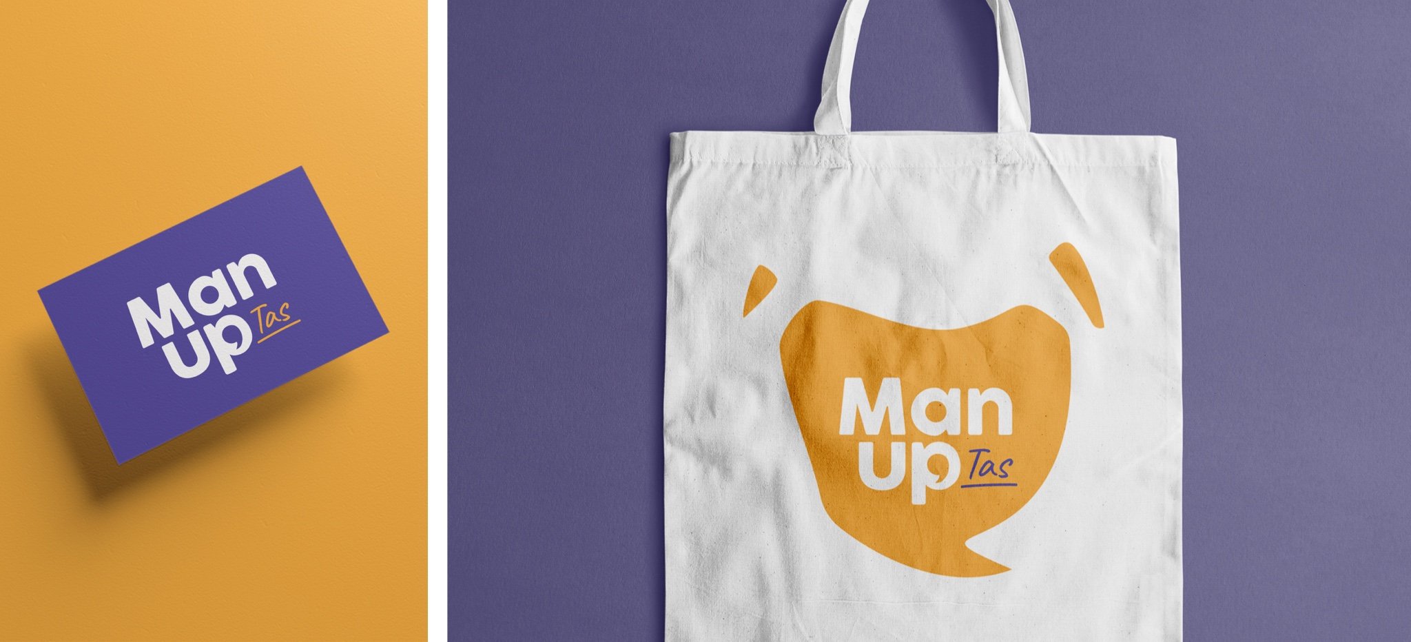
Our creative solution was inspired by the semi-colon, a symbol of strength widely used for mental illness sufferers and to promote mental health wellness and suicide prevention. We’ve used it within this logo to signify perseverance and to represent a continuation, not an end (specifically of life), and the decision to move forward. The speech bubble, shaped as Tasmania, is another significant symbol within the logo. It implies the importance of opening up conversation of men’s mental well-being in Tassie which (at its core) is what the organisation stems from.
In developing Man Up’s new branding we were aware of an added need to appeal to sponsors/stakeholders as well as adaptability into merchandise so that their message and services gain traction to help more Tasmanians, and in the long-term, Australians nationwide.


